
THE SYSTEM
At the intersection of FITNESS, culture, and community. Our identity is built around aN UNRIVALLED MEMBER experience.
The simplicity of the design system makes space for our content and CREATIVITY TO do the talking. If in any doubt while using this brand, "less is more" should be your guiding principle.
How CHANGE® engages with our community will continually evolve. Don't use these guidelines as gospel - take them as your starting point to create.

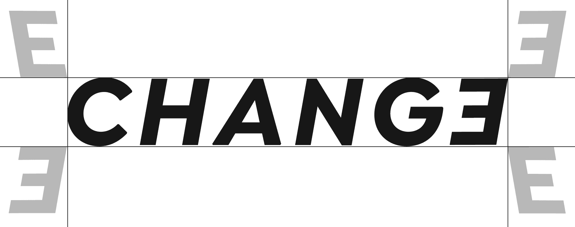
Primary Lockup
We lead with our wordmark as the hero of our identity. Our name represents our culture, and this should be used as the primary logo.

.75’’ or 50px
MINIMUM SIZE
This version is not intended for extremely small sizes. The minimum height is .75” for print applications and 50px for digital.
Clear Space
Clear space, or negative space, is the area that surrounds the logo that is completely clear of any other graphical element. Clear space helps the logo stand out from the rest of the elements on the page and ensures legibility, even at small sizes. As a general rule, the more clear space, the better.
Color Variations
WE ONLY EVER SEE THE CHANGE® LOGO USED in our two primary tones "CHANGE® WHITE" or "CHANGE® BLACK."
THE CHANGE® LOGO SHOULD NEVER BE USED OUTSIDE OF THESE COLOUR VARIATIONS. IT SHOULD ALSO NEVER BE USED 'INVERTED' OVER IMAGES.
IF YOU WISH TO APPLY THE LOGO OUTSIDE OF THESE BRAND COLOURS, OR IN A PARTNERSHIP CONTEXT. PLEASE CONTACT CHANGE® HEADQUARTERS FOR APPROVAL.
house of health
The house of health sub-brand has been created to support our evolving vision for the future of change®
it is important to note that the house of health sub-brand should never compete with the change® brand. to avoid this, they should never be presented alongside each other or stacked in the same desgin elements.
house of health is a creative expression for the brand and should always be treated as one. the design system has no rules, but in the interest of upholding the highest quality - we require all house of health designs to be approved by change® headquarters.


Logo Misuse
This page illustrates how not to use the CHANGE® logo or house of health sub-brand. These examples represent some of the most common errors, but do not necessarily constitute an exhaustive list. To maintain consistency of the CHANGE® brand, follow the guidelines outlined in this document.
Never attempt to alter, redesign, or add to the change® logo lockup.

Do not change the logo colour outside of the approved palette - unless approved by change hq in special use cases.

Do not apply a gradient or pattern fill to the logo.

Do not outline the logo.

Do not stretch, distort, or warp the logo in any way.

Do not crop or cut off the logo.

Do not change the typeface or recreate the Word mark.
Do not rotate the primary or icon versions logo.

Do not add a drop shadow or any other effect to the logo.

Do not position the logo over off-brand colors, patterns, or busy backgrounds.