Brand Colours
The primary colours of the CHANGE® identity take cues from OUR IN-STUDIO DESIGN FEEL as well as our two key business segments.
"TRAIN FAST" [deep RED] represents the higher intensity training elements. use of the red should be primarily as an accent colour where we wish to achieve a luxurious feel.
"Live slow" [rich green] speaks to our lighter movement and recovery elements. use of the green should be primarily as an accent where we wish to achieve a calming presence.
"CHANGE® WHITE" [light cream] is a neutral tone that reflects the well used sidelines of most surfaces. It's our workhorse, and a colour that is equally suited as both a background or foreground.
"CHANGE® BLACK" [Warm black] You can never go wrong if you default to using this black.
Primary Colours
TO MAINTAIN CLARITY IN OUR DESIGN PRESENCE WE PREFER TO USE OUR NEUTRAL TONES AS THE PRIMARY COLOURS. Our preference is to always use the logo with highest contrast for on screen graphics, OVER IMAGE, signage, and any other visual assets that might be influenced by changing light conditions.
CHANGE® BLACK
HEX #171717
RGB 23 23 23
CMYK 0 0 0 91
CHANGE® WHITE
HEX #f6f8f0
RGB 246 248 240
CMYK 1 0 3 3
Secondary Colours
Where we have greater control over the environment we can be more creative in our approach. "TRAIN FAST" and "LIVE SLOW" will create a meaningful presence when applied on merchandise, controlled lighting, or printed material.
LIVE SLOW
HEX #023c30
RGB 2 60 48
CMYK 97 0 20 76
TRAIN FAST
HEX #a40012
RGB 164 0 18
CMYK 0 100 89 36
Brand TypefaceS
WE USE THREE KEY TYPEFACES TO COMMUNICATE OUR MESSAGE.
neue haas grotesk display [MEDIUM]
is our primary heading typeface and should be used when we wish to appear more dominant or have a clean sans serif type design feel.
fraktion mono [regular]
is our primary body typeface and should be used when we have a longer message to communicate. this is also the primary font for all numerals, or workout graphics when legibility and simplicity is critical.
Bantley
is a typeface that we use in limited circumstances to add a considered luxury feel to our brand. never use this font to communicate messages longer than one line of text or without balancing the design with our other two typefaces.
Using Type Rules
When constructing layouts, these tips will help you build interesting, and on-brand compositions with typography.
While these rules are proven and sound, sometimes we break these to best communicate in certain circumstances. Please contact our brand team if you wish to gain special use permission.
JUSTIFIED [left] TEXT
Legibility and clarity are vitally important to great typographical layouts. we maintain clean lines by using 'justified' paragraphs and Since most people read from left to right, we should align our type accordingly.
Skip Weights & Double Size
Contrast is the name of the game when it comes to great design. When in doubt, skip a weight when pairing two weights, and double the size between two text elements.
Align X-Heights or Baselines
Whenever you place text next to each other, either align the baselines (the line that the bottom of a lowercase x sits on) or align the x-heights (the top of a lowercase x). This helps align each line visually.
Watch The Rag
When setting paragraphs, to maintain clean and straight lines we ensure our text is justified [left]. If the spacing unintentionally creates a weird looking shape, consider tweaking the language or resizing the container. Also, try to prevent single-word lines (orphans).
Give Things Space, If Needed
Negative space, or the space around elements is vitally important. That being said, if informational elements belong together, move them closer together. Use grouping wisely: just try not to cram too many things in one space!
Keep Line Length Reasonable
It is easy for the user to get lost in long lines of text, and short ones are easily ignored. It’s best to keep lines between 45 and 70 characters long, depending on the size of the font. This will ensure legibility as the font sizes increase or decrease.
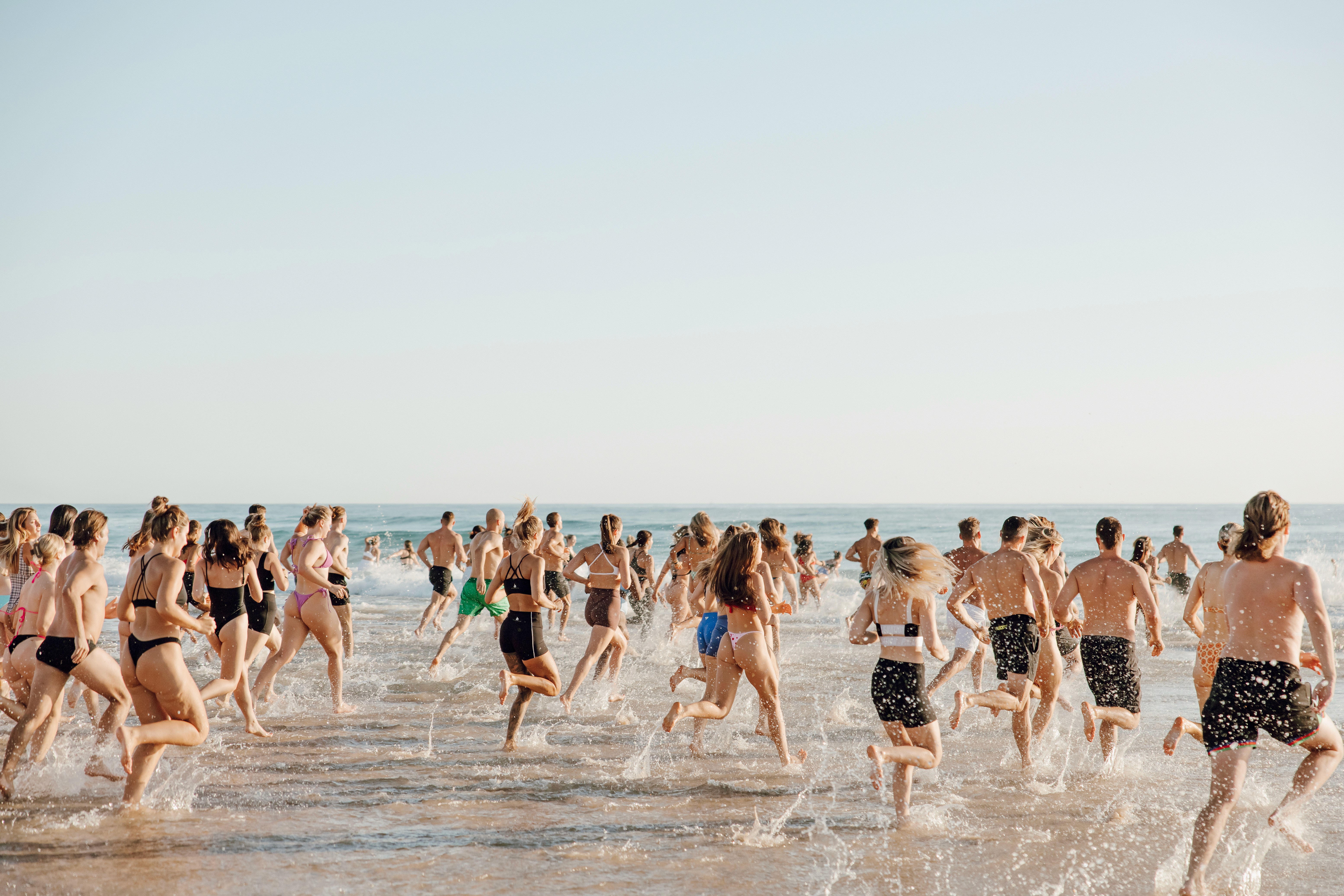
Photography / Videography
At CHANGE®, we believe that high-quality photography and videography is an essential component of our brand. We use this content to showcase our participants, events, and sponsors. (Our sample gallery will be available shortly for reference).